What are some of the worst dark patterns you've seen?
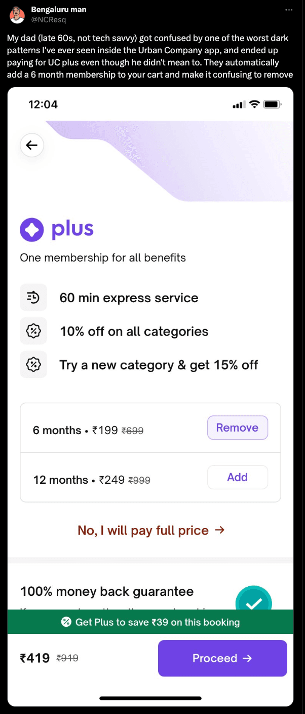
I will go first- sneaking in membership fees while making a purchase; urban company recently got some flak for it.


Why is it confusing? How is this dark pattern?
A lot of companies do it. Here the Remove button is right on face. Zepto hides it too much - delivery pass
If something is a value added service, you can suggest it during checkout. But adding it to the cart outright is the dark pattern.
An equivalent would be when you go to the supermarket checkout section, the staff throws in a few chocolates, some AA batteries and wet wipes - and then claims you can take them out if you’d like. ☠️
Auto opt-in is classified as a dark pattern by the government.

Try cancelling booked cab on Uber and Rapido. First of all it’s hidden behind the button ‘Trip details’. And then they take you through bunch of clicks to cancel.
Not sure if this qualifies as dark pattern but it’s irritating for sure
It very much is a dark pattern.
Booking a ride is much easier than cancelling it - aligned more with the company’s incentives and not the user’s needs.
Also, Rapido goes a step further by making the text on the Cancel button very hard to read by using horrible contrast. 😪

Uber also adds a “cancelling” motion graphic for 4-6 seconds, making you think as if you did something wrong and can undo it.
Zepto gives an option to select free delivery when eligible. 🤕

Electronic Arts is the dark pattern itself

Zomato with its tipping policy - if you’ve paid a delivery person a tip once, they will keep it preselected and not even call it out clearly. Or they will combine it with some donation & delivery fee so if you’re looking at it before you pay, you can’t catch it immediately
I once paid a delivery person a 50 rupee tip because they delivered in the rain, and then that has remained preselected without Zomato even calling it out

DrinkPrime doesn't allow to downgrade to any plan. If won't show the full pricing page

Urban Company advertise 49 rupee services only to add 140 visitation fee 😂

OG was the Book My Show ( add a smile ) donation, although a very small amount but later govt had to step in to formalise process and remove such additions .Now it's not added by default.
2.The other is convenience fee which a lot of travel tech website adds while you try to book a ticket, not a quite lot but again being upfront help decide which platform is Bette to go with.
3. Zepto sometimes uses this A/B test to apply free delivery even if you are a premium pass member, sometime in haste you might forget to apply the code/ press the button to activate free delivery on purchase order
4. This is a general oversation and not an dark Pattern, but a lot of apps has starts with price for lot of basic things like for resort booking or some package plan from urbanclap, the starts with price is just a show off.

:smile:

Whole Autopay in UPI is a scam first month they charge 2rs from next month it will increase to 100rs. It's very confusing process to revoke it.

That 2rs is deducted as part of compliance to ensure Auto-pay is validly created, it is refunded back shortly. However, I do agree that most companies don't handle the nuance properly

Scam in this is that for month they charge 2rs then increase from next month and many people forget to disable it. Even though they are not using the service amount will be deducted.

In general, wouldn't all subscription based products qualify as a dark pattern. What if I only want to use it for a month. I have to subscribe first and then cancel before the renewal date. I believe there used to be couple of services which used to cancel the service, the same day you used to cancel while you are already billed for the entire month. Apple TVs free plan for 3 months is also an example. The day you cancel before 3 months is done, is your last day for the plan.
Interesting observation. Subscription-based business models are a grey pattern, if there is such a thing.
At least they tell you upfront that this will be a recurring charge. So while the lock-in mechanism by requiring banking details upfront is prone to user error, at least you voluntarily sign up.
That said, some companies do try to hide/mislead even during sign up - including using introductory pricing that will change later, and other such tactics. And the practice of making cancellations difficult is most certainly a dark pattern.

