Is it a UI mistake?🤔
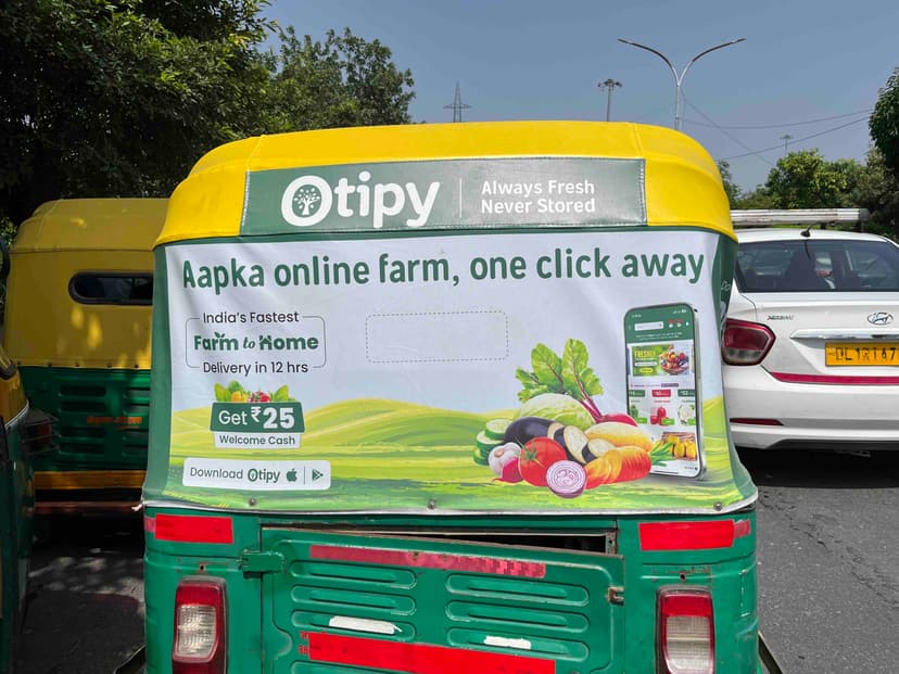
I saw this poster on the back of an auto-rickshaw. If you look closely, you’ll notice a box in the center with a dotted outline. What do you think it’s for? Is it meant for customized coupons, or is it just designed to match the auto’s rear window?


The dotted part is supposed to be cut off so that the auto driver can see the rear view. Designer has well designed it, but Indian auto drivers rarely use rear view . They just turn their auto in 360 degree to see the rear view 🤣

180 you mean?

Oops... It's 180 degree. Thank you for correcting me.

It's a transparent window for auto's rear view mirror. You can look at the auto on the left and you can see one.
Of course, auto drivers never use them considering how they drive. So they were redundant anyway I suppose.

I clicked this photo. I’m sure it was on the poster.

That patch was meant to be removed to make way for the window

Itna dimag kaun lagata h poster m wo bhi auto k…. ?

Cheap designer on fiver used a cheap template and shipped this in 5 mins and couldn’t be bothered to do any quality control