

Designers5mo
What are some of the worst dark patterns you've seen?
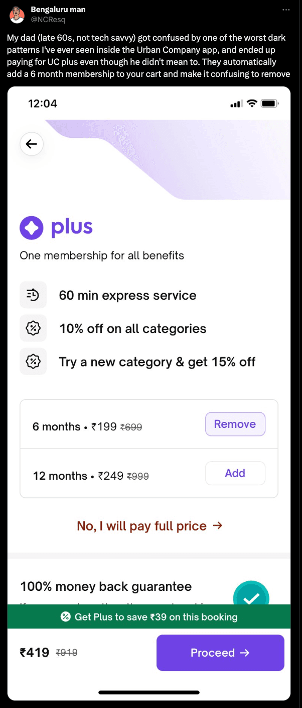
I will go first- sneaking in membership fees while making a purchase; urban company recently got some flak for it.
Top comment

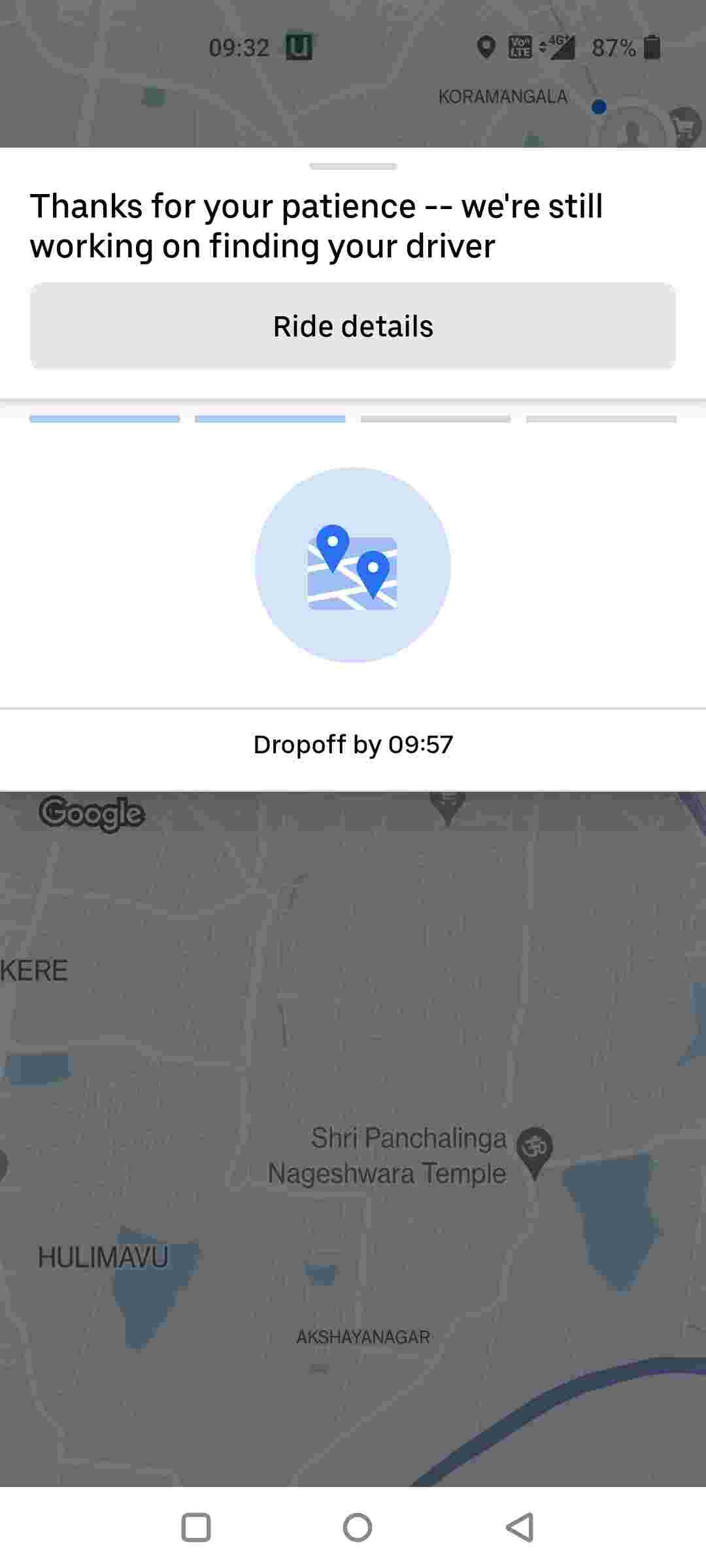
Try cancelling booked cab on Uber and Rapido. First of all it’s hidden behind the button ‘Trip details’. And then the...