Kintsugi
Kintsugi

OMFG Zepto’s Horrible Design Patterns Just Won’t Stop!

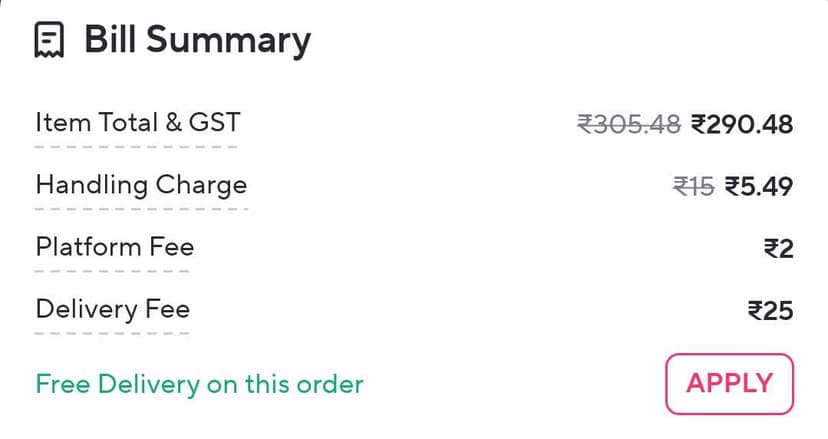
Already notorious for the likes of asking subscribers to “Apply” free delivery benefits for each eligible order, they’ve gone even further. Now if an order is running late, they just stop showing the status information and instead throw a generic apology message with an illustrated animation.

No way of tracking when the order started processing, when it was picked up, or anything at all. They also never supported map-based tracking that other apps do - guess because that’d keep them accountable.

It’s honestly disgusting to see this kind of design philosophy permeating an up and coming consumer startup in India. 🤕

Post image
3mo ago
LudwigVanBeethoven
LudwigVanBeethoven

Yeah, Zepto app is still pretty bad. I only used it for one order, and saw that they didn't have map-based tracking, and stopped using it.

Will give it a try again in the future, whenever they implement maps 😄

AmpleBlackbird
AmpleBlackbird
TCS3mo

The worst part - they don’t even let you cancel even if the order is late from their end

So many times that I’ve ordered something urgently while leaving somewhere and they don’t come on time nor do they let me cancel it.

Kintsugi
Kintsugi

Yes. It’s a real headache to deal with this.

DesignTinker
DesignTinker

Their orders are always delayed. I never saw this on my app. The illustration is not even related to the message. Most definitely is a bug.

Kintsugi
Kintsugi

Might be a recent change. Don’t think it’s a bug. The message is very clear; just lacks transparency. About the illustration, it’s an animated one. Shows a Zepto delivery guy moving slowly between cars in traffic. My screenshot didn’t capture that part.

UrbanIridescence
UrbanIridescence
Student1mo

The fact that they've just been spamming LinkedIn for product design hirings across all levels, they know something doesn't add up lol

Discover more
Curated from across