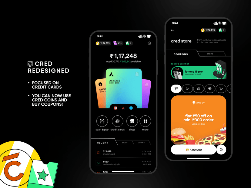
While I get that the app still looks very on brand, can’t help but feel how impractical and unoptimised the homescreen has become.
30% of the first fold used for an illustration nobody can recall, even if they open the app 10 times a day. (You can try recalling now and see what i mean)
Minor, but the icons seem to have mixed stroke weights and an unnatural blend of sharp and round corners.
Perhaps adding a “check bank balance” button on the first fold will he useful since this is a payment app and all. No point hiding it somewhere else.
Currently, the People section precedes the Businesses section. Once a user taps on the down arrow on people, the list expands to multiple folds and it becomes extremely tiresome to scroll all the way down to collapse the section to access the rest of the page.
Instead, why not have tabs for People and businesses, side by side. The tab could have a search button within it to easily find contacts. Currently, the search button is all the way on the header and disappears on scroll.
Showing photos and business of people is certainly helpful, but why not make a table that has a card that shows the profile pic, the last payment you sent to them, when you sent it and even a CTA for quick pay. Currently one needs two taps to pay someone.
Bills can have better prominence somewhere on a difference section and could even use an floating bar type of component that shows up towards the bottom of a screen when bills are due. (Similar to what swiggy uses to show “your food is being prepared”) It might remind a user that certain bills are due in X days
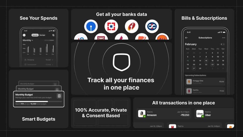
And by god use the rest of the page to show the user some stats on how they spent money. I for one would consistently use the app that showed me my spending breakup. Tell user they spent x% more on food this month, compared to last or some such.
And throw the offer & promotion section away. Its not 2018. Aint nobody playing games on here either.
