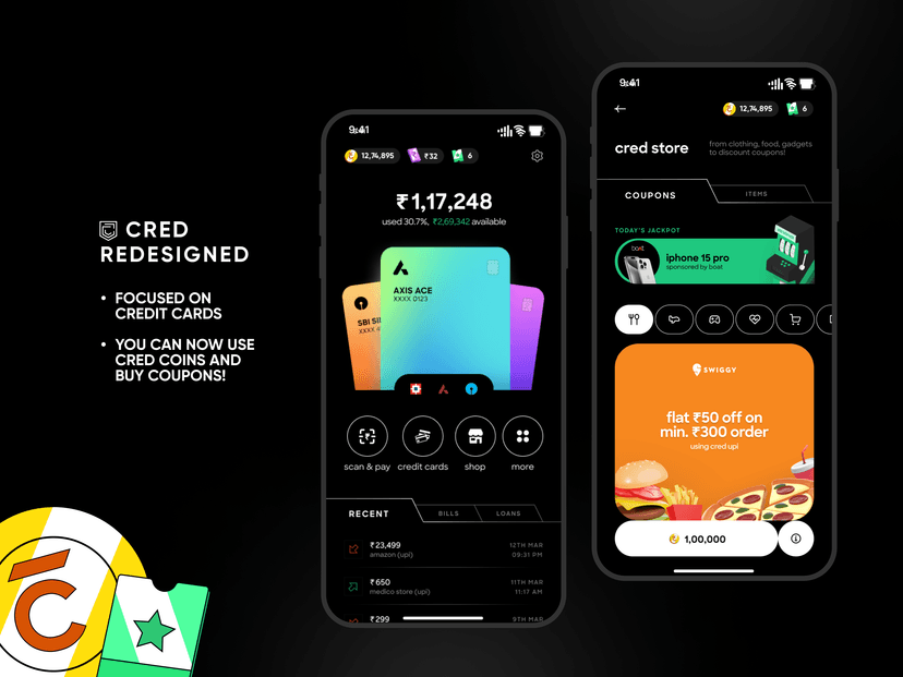
I redesigned CRED app. Thoughts?
You can manage all your cards in the homepage and it isnt hidden in some obscure place. But most importantly, cred coins are actually useful, at least you can get some coupons out of it.
My question to people seeing this would be, what could have been better and any constructive feedback is welcome. imo the icons could have been better, wdyt?

Talking product sense with Ridhi
9 min AI interview5 questions
I just dunno man. I login to CRED once in a month to pay my CC bills and keep searching around for stuff because they just keep moving every goddamn thing around. To make things worse it's all black and white. It's like a treasure hunt every time.
This looks better and welcoming! It also feels like CRED is suddenly celebrating pride month. 😂
🤣 Hmm, maybe an option to customize your cards would help it
Love it! So much cleaner
Thank you
Nice try, but I would work on the colors, especially the card ones. You can also make it more consistent in terms of shapes you're using.
Yeah I agree that the cards needs to be tweaked and wdym by consistent shapes? ive tried to go for a consistent rounded look
I feel that corner radius are bit off. Pills that you have used for the filter, can be better.
PS: Try to upload designs in high resolution, pixels are breaking in this one, and the status bar is duplicated for some reason.
I like the homescreen. I feel most people use it for creditcard bills only. Solving for the proper use case
Yeah, but if something else brings in more revenue they are more likely to prfioritize that, sacrificing the core aspect of the app
I agree.
This is actually 10x better than Cred
Thank you 😄
Originally CRED had an awesome UI. Simple professional and intuitive. I think that guy quit. And they have brought in some over enthusiastic geeks who want to test new stuff on their users. Second their business model is trying to pivot . They want to be used as payment app and not a credit card bill payment app. So credit cards have taken a back seat. To be honest I am no longer sure why I am using CRED. Just to hear that jingle of useless coins being won each time I press their cash back game. Completely useless products marked up and shown as on sale with CRED coins . Whereas as same stuff available on Amazon at Lower price. I am thinking of putting my cards in auto pay. Cause now even th notification have stopped coming in WhatsApp for bill payment. There is good chance I will miss payment due date if I trust them.
Even though I have my credit cards in autopay I still use CRED for the cashbacks. But yeah they arent focused on credit cards, might as well switch if a good app comes around in the future
Much more logical grouping of elements and information architecture. Good job
It's looking better than current cred app.